UESPWiki:Featured Images/Past Nominations/Archive 9
| This is an archive of past UESPWiki:Featured Images/Past Nominations discussions. Do not edit the contents of this page, except for maintenance such as updating links. |
Contents
- 1 File:ON-mount-Sabre Cat Frost Atronach.jpg
- 2 File:ON-interior-Dreudurai Glass Mine.jpg
- 3 File:SR-quest-The Ultimate Feast.jpg
- 4 File:ON-npc-Shilli.jpg
- 5 File:ON-creature-Dragon (grey).jpg
- 6 File:ON-npc-Clan Mother Tadali.jpg
- 7 File:ON-quest-The Bleeding Temple.jpg
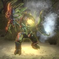
- 8 File:ON-creature-Dreadhorn Trampler 02.jpg
- 9 File:ON-creature-Trapjaw 02.jpg
- 10 File:BL-quest-Like Father, Like Son.png
- 11 File:ON-npc-Gray Host Chillrender 03.jpg
- 12 File:ON-misc-The Handfast.jpg
- 13 File:ON-npc-Pilgrim (Elsweyr) 02.jpg
- 14 File:ON-creature-Indrik 04.jpg
- 15 File:ON-place-Ebonheart 03.jpg
- 16 File:ON-creature-The Frigid Temptress.jpg
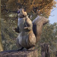
- 17 File:ON-creature-Squirrel.jpg
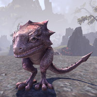
- 18 File:ON-creature-Scuttler.jpg
- 19 File:OB-place-Kvatch 02.jpg
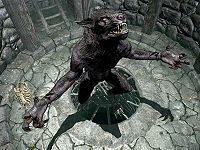
- 20 File:SR-npc-Sinding 02.jpg
- 21 File:ON-npc-Grundwulf 02.jpg
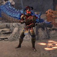
- 22 File:ON-npc-Cadwell the Betrayer 02.jpg
- 23 File:MW-map-Travel Routes.png
- 24 File:ON-creature-Molag Bal 04.jpg
- 25 File:ON-creature-Imp 03.jpg
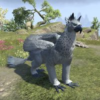
- 26 File:ON-creature-Gryphon 12.jpg
- 27 File:ON-creature-Saagranth.jpg
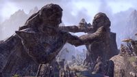
- 28 File:ON-place-Brothers of Strife.jpg
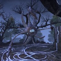
- 29 File:ON-creature-Dread Watcher.jpg
- 30 File:BL-creature-Crypt Wight.jpg
- 31 File:ON-place-Broken Coast Dolmen.jpg
- 32 File:ON-pet-Grisly Banekin Mummy.jpg
- 33 File:ON-creature-Voidmother.jpg
- 34 File:BM-creature-Ettiene of Glenmoril Wyrd.jpg
- 35 File:ON-npc-Skooma Cat 02.jpg
- 36 File:SR-quest-A Blade in the Dark.jpg
- 37 File:ON-quest-Cultural Conciliation 08.jpg
- 38 File:ON-quest-City Under Siege 02.jpg
- 39 File:SR-npc-Ulfric Stormcloak 06.jpg
- 40 File:ON-quest-The Cursed Skull.jpg
- 41 File:ON-creature-Sand Serpent.jpg
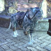
File:ON-mount-Sabre Cat Frost Atronach.jpg
A lovely image of a mount. High res, no rider, and complementary colours.
- Support: As nominator. —Legoless (talk) 15:41, 15 March 2022 (UTC)
- Support: He's a fine boi. A great image for the reasons listed by nominator. --AKB Talk Cont Mail 16:10, 15 March 2022 (UTC)
- Oppose: While the angle its taken at is honestly perfect, it blends into the background way way too much for me too consider it good (white-blue ice on white-blue tiles mixes). If it was retaken with the same angle quite literally anywhere else I'd support it. The Rim of the Sky (talk) 20:21, 15 March 2022 (UTC)
- Support: Pretty cool cat Weroj (talk) 22:11, 24 May 2022 (UTC)
- Oppose: I'm with Rim. The color balance is all out of wack - light blue on light blue. 173.49.208.25 04:43, 5 June 2022 (UTC)
- Oppose: I agree with Rim here. --Zebendal (talk) 15:45, 5 June 2022 (UTC)
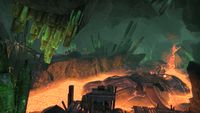
File:ON-interior-Dreudurai Glass Mine.jpg
One of my favorite scenic locations in Morrowind. This shot captures it perfectly.
- Support: As nominator. The Rim of the Sky (talk) 02:50, 5 March 2022 (UTC)
- Support: A genuinely perfect image. I can't imagine an argument for not giving this featured status. --AKB Talk Cont Mail 16:10, 15 March 2022 (UTC)
- Support: I've been thinking on this one for a while, and I have come to the conclusion that—while I don't personally find this location to be particularly aesthetically pleasing—it certainly is a unique environment, and this sweeping image captures it all wonderfully. Some great colours. —Legoless (talk) 16:42, 15 March 2022 (UTC)
- Support: Very well done shot.Tyrvarion (talk) 20:48, 15 March 2022 (UTC)
- Support: I don't upload images I don't like! ;) -Dcsg (talk) 00:04, 16 March 2022 (UTC)
- Support: Cool scenery Weroj (talk) 22:11, 24 May 2022 (UTC)
- Support: Very nice. We need more scenery images like this one. Blowthemandown (talk) 15:19, 21 June 2022 (UTC)
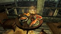
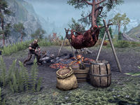
File:SR-quest-The Ultimate Feast.jpg
A delicious feast in stunning HD. I love the soft lighting in this shot, it really shows off some of Skyrim's new Fishing content.
- Support: As nominator. —Legoless (talk) 01:04, 17 November 2021 (UTC)
- Support: Easy support, we need to showcase some of this new cc content and the fishing creation seems to be very in depth and well done Dcking20 (talk) 01:49, 17 November 2021 (UTC)
- Support: This is something different, and it shows new content. --Talyyn (talk) 01:26, 24 February 2022 (UTC)
- Support: Who doesn't love a fish dish? --AKB Talk Cont Mail 16:10, 15 March 2022 (UTC)
- Comment: Would it be better at 4:3? I'm in favor of 16:9 for most things but there's some cases where the old ratio is better The Rim of the Sky (talk) 16:09, 27 May 2022 (UTC)
- Support: Agreed with the comment above, but I also enjoy the atmosphere in this shot. It's very warm and homey. -MolagBallet (talk) 23:07, 18 June 2022 (UTC)
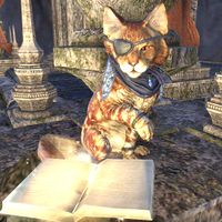
File:ON-npc-Shilli.jpg
I'm surprised no one has nominated this image yet. The NPC is in an interesting pose and takes up most of the frame, and the image isn't too dark. This exceeds the expectations for a good NPC image.
- Support: As nominator. -MolagBallet (talk) 18:53, 8 October 2021 (UTC)
- Oppose: Featuring another NPC cat would be redundant with Clan Mother Tadali above. Croaker (talk) 04:47, 11 November 2021 (UTC)
- Oppose: Well framed, but a bit too bright. —Legoless (talk) 13:09, 16 November 2021 (UTC)
- Support: A better shot than the Clan Mother Tadali pic above, which is sort of a feline equivalent of a neutral pose. Blowthemandown (talk) 00:53, 3 December 2021 (UTC)
- Oppose: The jaggies that ruin the whiskers ruin the image as well. --AKB Talk Cont Mail 16:10, 15 March 2022 (UTC)
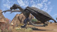
File:ON-creature-Dragon (grey).jpg
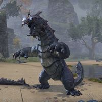
I am once again petitioning for your attention: please focus it on this. Why I like this image: big Dragon go "swoosh". Thank you.
- Support: As nominator. -MolagBallet (talk) 00:28, 17 September 2021 (UTC)
- Oppose: Looks like the dragon is T-posing to me. But more than that, the way its wing is positioned fills the image in an unappealing way. I think the image is an awkward angle. Croaker (talk) 04:47, 11 November 2021 (UTC)
- Weak Oppose: I think the pose its landing at is fine but the angle is odd The Rim of the Sky (talk) 21:13, 14 November 2021 (UTC)
- Oppose: Dragons are one of the hardest things in any game to get a good shot of that also looks right, this was a very impressive angle and timing to catch but the dragon looks quite awkward by my book. Dcking20 (talk) 02:15, 17 November 2021 (UTC)
- Support: Ahh, the big guy is waving. What a sweetheart! I like it, it's fun. --AKB Talk Cont Mail 16:10, 15 March 2022 (UTC)
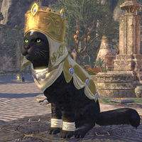
File:ON-npc-Clan Mother Tadali.jpg
This image is pretty simple yet cute, and the Alfiq is framed nicely within the shot itself, showcasing the cultural clothing of a Khajiiti clan mother.
- Support: As nominator. Zebendal (talk) 20:41, 13 September 2021 (UTC)
- Neutral: It's well framed, but it's just an NPC shot. —Legoless (talk) 08:54, 14 September 2021 (UTC)
Neutral: I agree with Legoless. It's a very nice shot: the subject is very clear, and the lighting is good, but she's idle. She's not in a particularly interesting pose or performing an action, just looking straight ahead. If she were doing something more than just sitting, I would definitely endorse it. -MolagBallet (talk) 23:18, 16 September 2021 (UTC)- Support: Oh, to hell with it, I'm a sucker for good NPC shots. -MolagBallet (talk) 18:09, 8 October 2021 (UTC)
- Support Croaker (talk) 04:47, 11 November 2021 (UTC)
- Neutral: A good and fine shot of a cat Dcking20 (talk) 02:03, 17 November 2021 (UTC)
- Oppose: The jaggies are too apparent to say its the best we can do. --AKB Talk Cont Mail 16:10, 15 March 2022 (UTC)
- Support: I like this one, good lighting and framing Weroj (talk) 22:11, 24 May 2022 (UTC)
File:ON-quest-The Bleeding Temple.jpg
Have I ever publicly commended The Rim of the Sky for his photography skills? Because I should commend The Rim of the Sky for his photography skills. I can't tell you how many iconic shots I've seen on the UESP that he's taken.
The drama, the intrigue, the danger... it's all captured in a wonderfully centered shot. A bit red, but what can you do? There's a sea of innocent blood in the sewers beneath the Temple.
- Support: As nominator. -MolagBallet (talk) 14:47, 28 June 2021 (UTC)
- Support: An excellent shot. —Legoless (talk) 07:37, 12 July 2021 (UTC)
- Comment: Would support, but the Xivkyn in the shot is barely discernible from its background. Some color correction could likely rectify this. -Dcsg (talk) 01:18, 23 July 2021 (UTC)
- Oppose: Too dark and a touch too busy, can barely make out what's being shown. Croaker (talk) 04:47, 11 November 2021 (UTC)
- Comment: Thank you again for the compliments! :) as for the lighting, unfortunately that's just how eso is for the most part. There might be a way to take a clearer shot by adjusting graphics (maybe even toggling npc aura and changing the color), but the easiest way to take a better shot would probably be using modded add-ons. I do think the angle of the shot is very good but I don't feel fair voting The Rim of the Sky (talk) 07:06, 14 November 2021 (UTC)
- Weak Oppose: personally not blown away by the shot Dcking20 (talk) 02:01, 17 November 2021 (UTC)
- Support: A fantastic action shot that also intrigues. --AKB Talk Cont Mail 16:10, 15 March 2022 (UTC)
- Oppose: Doesn't really wow you at first glance, too busy Weroj (talk) 22:11, 24 May 2022 (UTC)
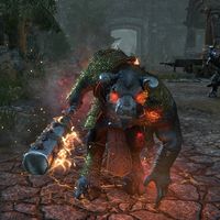
File:ON-creature-Dreadhorn Trampler 02.jpg
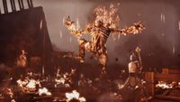
What a fantastic action shot. No UI elements mid-combat in what must have been a difficult moment to capture.
- Support: As nominator. —Legoless (talk) 13:23, 7 May 2021 (UTC)
- Mild Support: I'm not super enthusiastic about this image, but I appreciate the gloomy mood, as well as the contrast between the dark environment and the minotaur's red glow. -MolagBallet (talk) 18:37, 19 June 2021 (UTC)
- Oppose: Large number of creature images currently proposed for FI. I'd like some variety in subject matter. Croaker (talk) 04:47, 11 November 2021 (UTC)
- Support: Personally I don't take difficulty into account much when voting, going to be biased here but I really like the image. The Rim of the Sky (talk) 21:13, 14 November 2021 (UTC)
- Neutral: I’m not down to vote in favor of any Minotaur image to FA until the amazing shot of winged Domihaus is featured, even with the player in the pic that is one of the best eso shots I’ve seen captured. Dcking20 (talk) 01:55, 17 November 2021 (UTC)
- Support: I like the angry bull. --AKB Talk Cont Mail 16:10, 15 March 2022 (UTC)
File:ON-creature-Trapjaw 02.jpg
A very large, very angry wamasu. I enjoy this one because it's in an interesting pose and easy to see against the foggy backdrop of Glenumbra's environment. It has a pleasing silhouette.
- Support: As nominator. -MolagBallet (talk) 00:48, 17 September 2021 (UTC)
- Oppose: Would be an acceptable image if not for the coloration. It seems blandly dreary and flat. Croaker (talk) 04:47, 11 November 2021 (UTC)
- Support: Great action shot. —Legoless (talk) 16:37, 14 November 2021 (UTC)
- Support: Cool to catch it roaring The Rim of the Sky (talk) 21:13, 14 November 2021 (UTC)
- Oppose: I'm not a fan of the way it is centered (it feels off to me and I'm not sure why) and the tail and whatever spikey thing on the bottom left both butting in ~ Dwarfmp (talk) 20:40, 14 December 2021 (UTC)
File:BL-quest-Like Father, Like Son.png
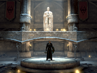
Woah, this image is just awesome especially for a game that has some inherent graphical limitations such as blades. For me the thing that makes this excellent is the framing and symbolism. The Thalmor operative clearly means business in his goal to hunt down and eliminate any and all Talos worshippers, meanwhile the god mankind himself looks on over the whole scene, and seems to almost be the one casting down that light in face of the darkness. Special shot.
- Support: As nominator. Dcking20 (talk) 22:55, 15 August 2021 (UTC)
- Weak Support: A standout image, but I get this slight impression that the image is a little lower in resolution than would be ideal. Croaker (talk) 04:47, 11 November 2021 (UTC)
- Support: This is a really awesome photo. As far as Blades goes this close to as high as the resolution gets usually The Rim of the Sky (talk) 21:13, 14 November 2021 (UTC)
- Support: Good composition and use of light. Good use of negative space to draw the eye to the center. Blowthemandown (talk) 20:16, 30 November 2021 (UTC)
- Comment: Can we get the subject centered, I find it really strange it's way off-center, otherwise I might support this ~ Dwarfmp (talk) 21:57, 30 November 2021 (UTC)
- Comment: I tried to put the subject right in the center of the image, but removed some of the surroundings. I believe it does improve the image quite a bit, but I would get it if people think it might remove a bit of the charm. --Ilaro (talk) 22:45, 30 November 2021 (UTC)
- Support: With the change I now support this ~ Dwarfmp (talk) 20:34, 14 December 2021 (UTC)
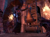
File:ON-npc-Gray Host Chillrender 03.jpg
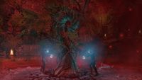
A really cool Harrowstorm picture. I found this was being used only on a single article for a generic enemy, but it's such an excellent shot I had to nominate it.
- Support: As nominator. —Legoless (talk) 19:05, 22 July 2021 (UTC)
- Mild Support: I didn't appreciate this one as much when I first uploaded it, but I will admit, the blue lighting cast on the witch pike from the vampires' spell highlights the focus pretty well, and it's atmospheric. -MolagBallet (talk) 00:23, 23 July 2021 (UTC)
- Oppose: It's good in composition, but its color brings the whole thing down. The subjects (the thingy and the people) are arguably darker than their background, save for their magic lights. Might be salvageable through color correction. -Dcsg (talk) 01:18, 23 July 2021 (UTC)
- Oppose: Dark and vague. Even at full zoom I'm having difficulty discerning the details, and we are not lacking for choice for a new FI at the moment. Croaker (talk) 04:47, 11 November 2021 (UTC)
- Mild Support: Its a very cool shot and scene indeed, the lighting is incredibly noisy tho, it can't be helped :/ The Rim of the Sky (talk) 21:13, 14 November 2021 (UTC)
- Oppose Not a special shot and even less special lighting imo. Dcking20 (talk) 02:02, 17 November 2021 (UTC)
File:ON-misc-The Handfast.jpg
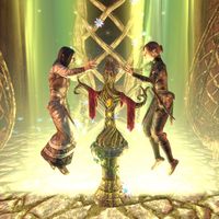
Forgive me for my many contributions to the nomination section, I'm a wiki-photographer, I'm in a mood, and I wish to present the site's loveliest images for all to see. I love how centered the subject is, and how the brilliant glow below the Silvenar and Green Lady illuminates them, making them stand out against the background. The framing, color and lighting make for a beautiful shot. What can I say? It's just magical.
- Support: As nominator. -MolagBallet (talk) 14:24, 28 June 2021 (UTC)
- Support: Pretty unique and nice colors.--Talyyn (talk) 06:15, 16 July 2021 (UTC)
Oppose: Incredibly busy and bright. Even capturing an event, it's not obvious at all what the event is. -Dcsg (talk) 01:18, 23 July 2021 (UTC)- Support: The lighting is too much, really, but thanks to the surrounding vibrant greens and yellows, I think it works regardless. I've tried to screenshot it, so I very much appreciate Rim's effort here. Especially as a thumbnail, it's beautiful. It's also a great scene, referring back to a considerable portion of AD zone quests in ESO, and - we don't have many images featuring Wood Elves or their culture. I'd say this image has earned its star for sure. Tib (talk) 15:46, 26 July 2021 (UTC)
- Weak Oppose: As already mentioned, a little on the bright side to be considered an ideal capture of the subject. But if there were no other proposals for FI (right now there are quite a few), this would suffice in a pinch. Croaker (talk) 04:47, 11 November 2021 (UTC)
- Comment: I have uploaded a new version of the image. I'm revoking my prior opposition, but since I can no longer have a fresh-eyed, first impression of it again, I can't tell if my initial concerns are no longer a concern, so I'm not casting a vote in support either. I can say that a few of the differences with this version at least take it in the right direction. Firstly, the brightness is more balanced. It's also 1:1 and centered, which helps to focus attention on the right stuff. That in combination with consolidated background elements and less overlapping with the foreground elements creates more distinct silhouettes, probably making it easier to grasp what's happening at a glance. The framing also pushes a bit more over their heads, making it more clear that the lights are actual beams, which could improve clarity regarding the most confounding element of this composition. -Dcsg (talk) 07:04, 11 November 2021 (UTC)
- Comment: I didn't think the arm covering Indaenir's face was a big deal since it captured their arms swaying around. If you could upload a 4:3 that might be better since the room is filled with the green energy from the effigy and that's the ratio often used for scenes — Unsigned comment by The Rim of the Sky (talk • contribs) at 07:03 on 14 November 2021 (UTC)
- Comment: Thank you! Don't think it'd be fair if I vote since I took the (original) shot but I appreciate the feedback — Unsigned comment by The Rim of the Sky (talk • contribs) at 07:03 on 14 November 2021 (UTC)
- Support: Great basegame eso cinematic shot. Dcking20 (talk) 01:59, 17 November 2021 (UTC)
File:ON-npc-Pilgrim (Elsweyr) 02.jpg
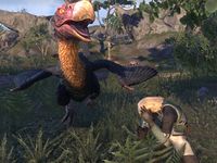
An action-packed shot of a terror bird in motion, charging the camera while a pilgrim cowers nearby. This screenshot was taken during a random encounter in Southern Elsweyr, where you find a pilgrim wandering the roads. The pilgrim hears a sound, and is attacked by a terror bird, which you can kill to help them out.
- Support: As nominator. -MolagBallet (talk) 14:04, 28 June 2021 (UTC)
- Oppose: Cool image of an event captured in an image, but as an NPC image, it's not the greatest; the subject of the shot (after whom the image is named) almost camouflages and is very easy to not realize is there. -Dcsg (talk) 01:18, 23 July 2021 (UTC)
- Oppose: Per Dcsg. Croaker (talk) 04:47, 11 November 2021 (UTC)
- Support: This shot is very funny. Could be improved a little by taking it a little bit farther out but very good nonetheless. The Rim of the Sky (talk) 21:13, 14 November 2021 (UTC)
- Weak Oppose: better images in the nomination queue. Dcking20 (talk) 01:58, 17 November 2021 (UTC)
- Support: I think it's a funny-looking image, and from what I know captures closely and exactly what this event is supposed to be. I don't think the name of the image is a factor to take into account here ~ Dwarfmp (talk) 20:34, 14 December 2021 (UTC)
File:ON-creature-Indrik 04.jpg
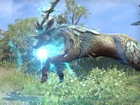
An impossible shot made manifest: the indrik leaps into a portal. I set out to capture images of creature abilities, and this one came after approximately 45 minutes of running circles around the same indrik. They were 45 minutes well spent, because I think I used up my beautiful creature shot luck entirely with this one. Wonderfully in motion and on the brink of being yet another missed shot, I think about this one often.
- Support: As nominator. -MolagBallet (talk) 19:18, 19 June 2021 (UTC)
- Support: Great image of an action taking place. -Dcsg (talk) 01:18, 23 July 2021 (UTC)
- Support Croaker (talk) 04:47, 11 November 2021 (UTC)
- Support: God i love indriks The Rim of the Sky (talk) 21:13, 14 November 2021 (UTC)
- Support: Dcking20 (talk) 01:57, 17 November 2021 (UTC)
File:ON-place-Ebonheart 03.jpg
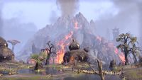
On its own, the marshy district outside Ebonheart may seem unremarkable. But in this lighting, and with a full, glorious view of Ash Mountain in the background, the humble scene is alive with color. The district is full of fertile soil, livened by the ashfall from the construct of devastation looming over the horizon.
- Support: As nominator. -MolagBallet (talk) 19:18, 19 June 2021 (UTC)
- Support: Solid. -Dcsg (talk) 01:18, 23 July 2021 (UTC)
- Support: The image's focus is unclear (Ash Mountain or the Argonian huts?), but still an interesting vista. Croaker (talk) 04:47, 11 November 2021 (UTC)
- Support: A nice scenic image of Ash Mountain The Rim of the Sky (talk) 21:13, 14 November 2021 (UTC)
- Support: Dcking20 (talk) 01:56, 17 November 2021 (UTC)
File:ON-creature-The Frigid Temptress.jpg
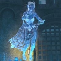
I don't think I've ever looked at an image and immediately thought "that deserves to be featured" until now. The pose, the angle, the details. The way the distortions and imperfections in the surface of the ice stand out against the deep blue, the way her almost glowing icy form stands out against the foggy teal background. The contrast between the nereid, the fog, and the yellow lantern at the bottom-center, the way her shawl gets frostier the further away from her arms it is, and how that frost stands out against everything else, the lighting coming up from beneath the nereid...
If this doesn't get featured, I at least need to know Vyraesi's graphics/lighting settings so I can replicate them on my own machine. This entire image is blue, but unlike other mostly-monochrome submissions I've posted to the Featured Images gauntlet, the subject's very outline stands out against the background due to the ice's textures. This is a work of art.
- Support: As nominator. -MolagBallet (talk) 02:58, 12 July 2021 (UTC)
- Support: Very pleasing to look at. -Dcsg (talk) 01:18, 23 July 2021 (UTC)
- Neutral: We have one old Nereid FI, I think, and this is the same model, sharing the animation and poses. But I really like the quality of this image, all the details visible plus the lighting in the background is good. So this is a bit difficult, since this is really an excellent creature image. Tib (talk) 15:50, 26 July 2021 (UTC)
- Comment: My only extremely minor quibble is that there is another creature in the background, by her feet. It's a great image otherwise, but I'm finding that distracting.--Theolaa (talk) 19:30, 4 August 2021 (UTC)
- Weak Support: Tib's concern is the only thing that prevents me from giving this full support. Croaker (talk) 04:47, 11 November 2021 (UTC)
- Weak Support: I like the pose, but I do feel the shot could be taken with the Nereid in a different part of the room, idk The Rim of the Sky (talk) 21:13, 14 November 2021 (UTC)
File:ON-creature-Squirrel.jpg
Pictured: Lady N in the wild. When I replaced the original image, I didn't want to replace it with a screenshot of a squirrel in an inferior pose. The little critters that inhabit Tamriel deserve no less than high resolution images that have their personality on full display. The autumnal trees in the background provide a lovely (and suitable) background without distracting from the subject in the foreground.
- Support: As nominator. -MolagBallet (talk) 14:16, 28 June 2021 (UTC)
- Support: What is most curious is how there is not a single nut in this game!! She is imploring you to send /feedback right now!! Erorah (talk) 13:51, 12 July 2021 (UTC)
- Oppose: The extreme closeup of a small object makes the normally-detailed textures look crude, and the squirrel looks lifeless as a result. Blowthemandown (talk) 23:25, 15 July 2021 (UTC)
- Oppose: An average creature image. -Dcsg (talk) 01:18, 23 July 2021 (UTC)
- Oppose: Per Blowthemandown. Otherwise, I agree with the intent behind showcasing this image. Croaker (talk) 04:47, 11 November 2021
(UTC)
- Support: excellent lighting, pose, and background! I wouldn't judge it based off the low 2014 polygons since that can't be helped and we feature older game images (with very old graphics) all the time The Rim of the Sky (talk) 21:13, 14 November 2021 (UTC)
File:ON-creature-Scuttler.jpg
An image of a critter named the Scuttler. anyone aware of how hard it is to take a picture of a critter without the luxary of single player free-roam camera commands knows the frustration of taking a close up shot of a critter, plus add to the fact that we cannot freeze all actors in a world like we can in single player games makes a shot like this pretty darn impressive. Technical difficulty aside, he is adorable, and he fills in the real estate of the photo space nicely.
- Support: As nominator. Zebendal (talk) 15:35, 26 June 2021 (UTC)
- Support: A well-lit shot with pleasing shadow placement. This captures the Scuttler's cuteness in glorious high resolution. -MolagBallet (talk) 17:17, 26 June 2021 (UTC)
- Support: This creature is so adorable! Amazingly captured for detail, and that 'Mona Lisa' smile :) Erorah (talk) 13:50, 12 July 2021 (UTC)
- Oppose: An average creature image. -Dcsg (talk) 01:18, 23 July 2021 (UTC)
- Oppose: Per Dcsg. Croaker (talk) 04:47, 11 November 2021 (UTC)
- Support: He looks very polite
File:OB-place-Kvatch 02.jpg
An emotive landscape shot with no UI elements, that tells a story. The wide angle is nicely done, and you would hardly think it was from such an old game it looks so good.
- Support: As nominator. Blowthemandown (talk) 00:13, 20 May 2021 (UTC)
- Oppose: As cool as the shot is, the thumbnail kinda shows that it would not look very good as the featured image. -Dcsg (talk) 01:18, 23 July 2021 (UTC)
- Oppose: Think I'm with Dcsg on this one. —Legoless (talk) 15:59, 26 July 2021 (UTC)
- Oppose: This shot is really cool, and I appreciate this image, but it's hard to see the content in the thumbnail. It was previously nominated and failed to pass for the same reason. -MolagBallet (talk) 17:29, 4 September 2021 (UTC)
- Oppose: Per MolagBallet. Croaker (talk) 04:47, 11 November 2021 (UTC)
- Neutral: As large as the resolution is, something tells me the textures might not be at high quality settings, hard to tell The Rim of the Sky (talk) 21:13, 14 November 2021 (UTC)
File:SR-npc-Sinding 02.jpg
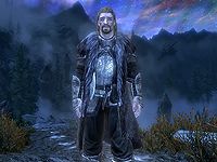
This is a nice cinematic shot. It's pretty high res, the subject takes up plenty of screen real estate and he casts a lovely shadow that shows how imposing he is.
- Support: As nominator. -MolagBallet (talk) 23:03, 19 August 2020 (UTC)
- Support: Cool angle and the shadow is nice as well... superb details thanks to the high quality. Definitely fitting as FI. (Unless there's some similar SR FI image already...?) Tib (talk) 17:37, 25 September 2020 (UTC)
- Comment: Well, since Tib brought it up, there is this image which is somewhat similar, but it was featured 7 years ago. There's also this image which is already in the queue as one of the next FIs; it's not SR but it is similar to some extent. Not that there's anything wrong with having multiple werewolf FIs, as long as they're not featured too soon after one another. — Wolfborn↝(Howl) 19:34, 25 September 2020 (UTC)
- Oppose: Per Wolfborn's comment, it's too similar to existing FIs. To add to the list, this image was featured in 2014. —Legoless (talk) 08:20, 12 July 2021 (UTC)
- Oppose: Per Wolfborn and Legoless. Croaker (talk) 04:47, 11 November 2021 (UTC)
- Weak Support: Lots of werewolf images in the past but this one has cool lighting and setting The Rim of the Sky (talk) 12:19, 16 November 2021 (UTC)
File:ON-npc-Grundwulf 02.jpg
Great framing, good colouring; a high res image capturing a cool group dungeon moment (dude drank dragon blood). Pretty difficult shot to take and this one came out looking excellent.
- Support: As nominator. —Legoless (talk) 23:34, 8 December 2020 (UTC)
- Support: I don't disagree with that notion. He's centered, the mist isn't too in front of his helmet (making the details on the front of the helmet visible, which is always a plus), and he's fully in-frame and high res. -MolagBallet (talk) 03:46, 29 January 2021 (UTC)
- Support: The only way this pic could be improved is to retake it closer up to get rid of the excess ~100 pixels on the bottom, other than that its a really great shot! The Rim of the Sky (talk) 18:08, 29 January 2021 (UTC)
- Support: This is a kick ass image of a really cool character that eso put out in dungeon content. On a slightly related note one of us loreboys needs to pump out a page for this guy quick! Dcking20 (talk) 23:13, 15 August 2021 (UTC)
- Support Croaker (talk) 04:47, 11 November 2021 (UTC)
- Comment this bad boy has received the five votes, and unanimously approved. Can an admin add this one to the queue? Dcking20 (talk) 07:08, 14 November 2021 (UTC)
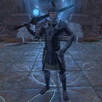
File:ON-npc-Cadwell the Betrayer 02.jpg
I find this image to be very impressive, I love the way the screen shot was took where he is holding his sword.
- Support: As nominator. -TheVampKnight (talk) 10:20, 3 February 2021 (UTC)
- Oppose: Perfectly fine NPC image, but it's dark and not very impressive. —Legoless (talk) 22:05, 28 February 2021 (UTC)
- Weak Oppose: I think the pose and resolution are very good, but the problem is the lighting is coming from the backside, making it very poor. I guess using Almalexia's lantern in front of him in a new pic would get rid of this issue, I'm just worried it would not be as high res. The Rim of the Sky (talk) 22:23, 28 February 2021 (UTC)
- Oppose: It has nice framing and a good pose, but it could be improved. I agree with Rim of the sky on the lighting. If it came from the front, the details on the character would be more prominent. His armor is darker than the environment, so he technically stands out, but he doesn't stand out in a very aesthetically pleasing way. The colors are too similar for him to stand out in a way that "feels" right. -MolagBallet (talk) 22:55, 17 March 2021 (UTC)
- Oppose: The color balance here is all out of wack. -Dcsg (talk) 01:18, 23 July 2021 (UTC)
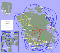
File:MW-map-Travel Routes.png
This is a bit of an odd nomination due to it being an image of a technical nature. However, I often see this image cited online, and I think it is the best illustration of Morrowind's various somewhat confusing travel routes. The map is clear, custom made, and accounts for all official expansions and plugins. Plus it's just pleasing to the eye, even as a thumbnail.
- Support: As nominator. —Legoless (talk) 09:15, 28 July 2021 (UTC)
- Support: Sure I'll support it, since it does all that and because of the interesting nature of the nomination. TheVampKnight (talk) 09:20, 28 July 2021 (UTC)
- Support: It's something different and it is known outside of UESP. --Talyyn (talk) 10:16, 28 July 2021 (UTC)
- Support: Very useful, I have used it myself during my playthroughs. Zebendal (talk) 20:22, 28 July 2021 (UTC)
- Support: Neat idea for a FA, and very useful image to boot. Dcking20 (talk) 23:06, 15 August 2021 (UTC)
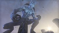
File:ON-creature-Molag Bal 04.jpg
A cinematic shot that's well-lit. The pose is interesting, and the color on the subject gets brighter as you move up his form, making him stand out even better against the sky. Speaking of: the sky is an enrapturing blend between the colors of Coldharbour's billowing blue ash clouds and the setting sun, which is positioned in just the right way to give Molag Bal more emphasis as the focal point of the composition.
- Support: As nominator. -MolagBallet (talk) 18:37, 19 June 2021 (UTC)
- Oppose: It's a good image, but the squat pose is extremely cursed and we've already featured a similar image. —Legoless (talk) 08:54, 30 June 2021 (UTC)
- Support: It's a good image, and the squat pose is extremely cursed, even if we've already featured my old image. —The Rim of the Sky (talk) 23:45, 15 July 2021 (UTC)
- Oppose: It's a good image, but the squat pose is extremely cursed and we've already featured Rim's similar image. —Zebendal (talk) 00:51, 16 July 2021 (UTC)
- Comment: That's fair. He's having a real good time teleporting in. I'm a little ticked that I missed the opportunity to get the latter half of this animation at a fun angle before the PTS flipped; I'd have to do the Main/Coldharbour questline to completion for the 3rd time this year if I want to shoot that. -MolagBallet (talk) 05:42, 16 July 2021 (UTC)
- Support: I think this image is absolutely based and the cursedness only makes it better. --Alexis Ashwing (talk) 10:37, 16 July 2021 (UTC)
- Oppose: Indeed cursed, and even without, he's not looking at anything discernible and you can't tell where his feet meet the ground, so it's disorienting. -Dcsg (talk) 01:18, 23 July 2021 (UTC)
- Support: The more I look, the more cursed it gets. It's a fantastic image with a beautiful mix of colour and light. --Oriwa Talk 21:50, 31 July 2021 (UTC)
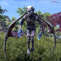
File:ON-creature-Imp 03.jpg
This image has wonderful lighting, and the subject takes up most of the shot.
- Support: As nominator. — Unsigned comment by MolagBallet (talk • contribs) at 02:44 on 25 September 2020 (UTC)
- Support —Legoless (talk) 08:00, 25 September 2020 (UTC)
- Nasty, ugly little thing. But nevertheless I Support. Schiffy(Talk) 22:51, 26 October 2020 (UTC)
- Support: I rly like the shading on it, kinda hot The Rim of the Sky (talk) 01:17, 10 November 2020 (UTC)
- Oppose The lighting's good, but the picture's dull. Just a basic idle post - an image of it attacking would be much better.— Unsigned comment by Blowthemandown (talk • contribs) at 05:30 on 4 June 2021 (UTC)
- Support: Good colors, me like. -Dcsg (talk) 01:18, 23 July 2021 (UTC)
File:ON-creature-Gryphon 12.jpg
Look at this lady. Ears perked up, head cocked slightly to the side. She's judging you.
- Support: As nominator. -MolagBallet (talk) 00:52, 10 August 2020 (UTC)
- Support: OK I will make an exception because
heshe looks very polite The Rim of the Sky (talk) 01:10, 10 August 2020 (UTC) - Oppose: Sorry, but I'm just not a fan. The subject of the image is so low-res and jagged looking that when it's blown up to be looked at it just doesn't look appealing to me. And, the way the lighting is interacting with it just isn't working for me with how unevenly lit up different parts like the wings and the shoulders just forward of them are. All in all, it's just a barely adequate profile shot for the page that's no different from the thousands of other creature images kicking about on the UESP, so it's hard to imagine this as Featured Image material. -Damon talk ♥ edits 15:58, 10 August 2020 (UTC)
- Oppose: I love the pose and the amount of photo real estate this photo takes, but I feel like it should be retaken now that you have a better graphics card since its blurry.Zebendal (talk) 09:53, 3 February 2021 (UTC)
- Oppose: There's really nothing that makes the image stand out. I'd also want a different angle on a majestic bird like gryphon, to prevent it looking like a confused giant four-legged chicken. Tib (talk) 15:36, 26 July 2021 (UTC)
- Comment: I will say that I now oppose my own nomination; my standards have risen since the arrival of my PC. -MolagBallet (talk) 04:45, 2 August 2021 (UTC)
- Comment: Honestly I didn't realize this was a low res image at all, its noticeable when focusing on the background but not immediately clear when looking at the subject (gryphon) itself, I'd still consider it a nice image The Rim of the Sky (talk) 10:02, 2 August 2021 (UTC)
File:ON-creature-Saagranth.jpg
A difficult shot with no UI elements, featuring a boss from ESO's new solo Arena in the midst of casting an ability.
- Support: As nominator. -MolagBallet (talk) 17:55, 6 November 2020 (UTC)
- Support: he looks cool The Rim of the Sky (talk) 01:17, 10 November 2020 (UTC)
- Support: A very cool shot with some nice detail. The outline looks a little odd at first but I think it actually adds to it. --Oriwa Talk 01:31, 14 November 2020 (UTC)
- Comment: Speaking of the outline, that's a detail I thought about explaining, but forgot to do. The boss during this fight basically manifests as a golden glow which you can see possessing the husks around the battlefield. The yellow outline is part of the effect, and isn't a UI element. Only bringing this up because it could possibly be mistaken for a UI element by some. — Unsigned comment by MolagBallet (talk • contribs) at 02:27 on 14 November 2020 (UTC)
- Oppose: Even if it's not a UI effect, the glow looks strange. —Legoless (talk) 23:57, 15 January 2021 (UTC)
- Oppose: It would be nice if the glow could be skipped, but if it's a permanent effect he casts on himself, then it will be tricky... which is a shame. Apart from that I wonder if we already had some lurcher FI? If not, it would be great to get one for sure. --Tib (talk) 09:21, 23 June 2021 (UTC)
File:ON-place-Brothers of Strife.jpg
Previously nominated by Tib about 4 years ago, it didn't pass due to the lighting and it being hard to make out what it depicts. I have replaced the old screenshot previously taken Vordur, and replaced it with my own. I took advantage of the newer image standards to fit in more of the figure, and took it in clear lighting. I will quote Tib on the significance of the carved cliffs.
"A window to the past of Stonefalls... This statue tells a story of two brothers and their ultimate sacrifice to save their home in the face of war. Brothers of Strife is an interesting bit of lore and, in my opinion, one of the things you definitely take with you when you leave the Stonefalls area in ESO. Again, this is such a great FI material. As above, if there is something you think could be improved, share your thoughts!"
And there you have it.
- Support: As nominator. Zebendal (talk) 05:22, 27 October 2020 (UTC)
- Support: Pretty cool scenery, looks better with the daylight now too The Rim of the Sky (talk)
- Support: Nice landscape shot.--Talyyn (talk) 01:38, 10 November 2020 (UTC)
- Support: A wonderful, clear shot! No complaints here. -MolagBallet (talk) 03:47, 29 January 2021 (UTC)
- Support: I'm really happy to see the image being re-nominated. And thank you kindly for the quote, Zebendal! Tib (talk) 09:17, 23 June 2021 (UTC)
File:ON-creature-Dread Watcher.jpg
What a wonderful image! It's so expressive, despite the subject being a many-eyed (most of which don't have lids), tentacled monster. The entire beast is in-frame, the lighting works, and the colors are similar without making it too difficult to see the subject.
- Support: As nominator. -MolagBallet (talk) 03:46, 29 January 2021 (UTC)
- Support —Legoless (talk) 05:27, 29 January 2021 (UTC)
- Neutral: As flattered as I am by the nomination, I was never a fan of how the contrast turned out due to lack of shadows. Its just an inherent problem with Dark Anchor pics, the Dread Watcher has the exact same color scheme as the dolmen so (unless I retook the pic in the Alik'r) the Watcher is always going to blend in with the background. That being said, I do like the pose I got the Watcher in, and everybody is entitled to vote on this pic how they want but to me I think there are better pics of Watchers out there The Rim of the Sky (talk) 18:08, 29 January 2021 (UTC)
- Support Well its a Watcher and its cute, and also the fact it blends into the background is what is so neat about the picture so it has my support. TheVampKnight (talk) 10:01, 3 February 2021 (UTC)
- Oppose: We had already featured a similar picture before. This one beats it in the amount of photo real estate and the pose it has, but the previous one beats it in having a background that doesn't blend into it.Zebendal (talk) 10:27, 3 February 2021 (UTC)
File:BL-creature-Crypt Wight.jpg
High resolution, great lighting with perfect highlights/contrast. Background neither busy nor boring. It would be great to have a Blades image featured, and this gets almost the most possible out of a Blades screenshot.
- Support: As nominator. -Dcsg (talk) 02:12, 23 August 2020 (UTC)
- Support: Fine work gentleman --Lilybit (talk) 20:55, 24 August 2020 (UTC)
- Support: For a blades image, it is pretty good. Personally, i feel like blades shots are held back by being primarily on Mobile, but once PC comes out, we will get betters shots.Zebendal (talk) 21:40, 19 October 2020 (UTC)
- Neutral: The cave background blends in with the wight's own colors and makes it hard to distinguish, would be better if it was retaken in an Ayleid ruin near blue light The Rim of the Sky (talk) 01:17, 10 November 2020 (UTC)
- Support: Nice Blades image, good example of what a creature image should be. Imperialbattlespire (talk) 23:27, 15 January 2021 (UTC)
File:ON-place-Broken Coast Dolmen.jpg
A wonderful composition with a stunning arrangement of color and value. The sun shining behind the chains is the epicenter of the image, drawing attention to the anchor. The landscape around the dolmen accents the main focus without drawing too much away from it, and adds to the beauty of the scene.
- Support: As nominator. -MolagBallet (talk) 18:31, 30 October 2020 (UTC)
- Support: I am biased but I am proud of this shot The Rim of the Sky (talk) 01:22, 10 November 2020 (UTC)
- Support: Woah... per nom, this is a really beautiful image. --Oriwa Talk 01:31, 14 November 2020 (UTC)
- Support: Completely agree with the nominator. Composition, lighting, color, atmosphere, mood -- totally beautiful. — Wolfborn↝(Howl) 03:00, 14 November 2020 (UTC)
- Support: I thought I already supported this, but this photo has a nice theme to it, with light shining on the dark site that is the dark anchor.Zebendal (talk) 23:17, 17 January 2021 (UTC)
File:ON-pet-Grisly Banekin Mummy.jpg
Look at this Lad. He takes up most of the screen real estate, you can see the little details in his little linen wrappings, and the way his little hands are folded... you can tell he's scheming.
- Support: As nominator. -MolagBallet (talk) 00:52, 10 August 2020 (UTC)
- Neutral: Really great angle but the lighting is very off, I think it's just an issue with all pictures taken in the Grand Psijic Villa since the 24/7 orange Artaeum sky doesn't work well on everything The Rim of the Sky (talk) 01:10, 10 August 2020 (UTC)
- Neutral: Its too blurry and the lighting is off. I recommend putting a Clockwork Illumanator near it to give it better lighting.Zebendal (talk) 02:55, 10 August 2020 (UTC)
- Oppose: Per arguments given in the neutrals. -Damon talk ♥ edits 15:58, 10 August 2020 (UTC)
- Oppose: Lighting is off, and is too blurry. Zebendal (talk) 09:53, 3 February 2021 (UTC)
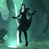
File:ON-creature-Voidmother.jpg
Just thought it showcased a dark spirit in neat supernatural lighting which is further made cool with the lightning striking behind her. Who doesn't want a Namiran goth gf?
- Support: As nominator.Zebendal (talk) 01:16, 10 November 2020 (UTC)
- Support: love her energy!! 🤩🤩 The Rim of the Sky (talk) 01:22, 10 November 2020 (UTC)
- Support: Really great image with a delightful atmosphere. -Dcsg (talk) 06:26, 10 November 2020 (UTC)
- Support: Per above, very good lighting and atmosphere. --Oriwa Talk 01:31, 14 November 2020 (UTC)
- Support: It looks eerie and cool.--Talyyn (talk) 10:38, 16 January 2021 (UTC)
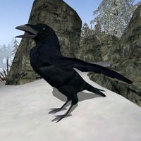
File:BM-creature-Ettiene of Glenmoril Wyrd.jpg
A clear new image of this rare Bloodmoon creature. A vast improvement over what was there originally, and framed very well in my opinion.
- Support: As nominator. —Legoless (talk) 00:42, 19 October 2020 (UTC)
- Support: Big improvement over the older shot.Zebendal (talk) 07:27, 19 October 2020 (UTC)
- Support: Krr- AWWGH! Nevermore! -- SarthesArai Talk 12:35, 19 October 2020 (UTC)
- Support: A very crisp, clear shot. The subject is well-framed, takes up plenty of space, and stands out nicely against the white snow. --Oriwa Talk 04:29, 20 October 2020 (UTC)
- Support: The subject takes up most of the shot and stands out clearly against the background. -MolagBallet (talk) 02:04, 29 October 2020 (UTC)
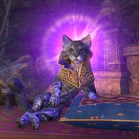
File:ON-npc-Skooma Cat 02.jpg
This is a shot taken of Sheogorath in his Skooma Cat form. Reasons to nominate this.
- Cats are superior to humans
- Sheogorath, but in cat form
- Is the best floofs you can get
- Look at his face, you shall give him all the cheese and skooma
Please support the one and only true daedric prince, or skoomer floofs will use your entrails as a jump rope. That is all. :P
- Support: As nominator.Zebendal (talk) 03:19, 23 August 2020 (UTC)
- Support: Majestic. - Dcsg (talk) 05:34, 23 August 2020 (UTC)
- Support: Good lighting, good graphics, appealing pose, and a good balance between the Character and the particle effects. -MolagBallet (talk) 06:27, 23 August 2020 (UTC)
- Support: Iconic image at this point. Imperialbattlespire (talk) 21:01, 19 October 2020 (UTC)
- Support: Looks neat and as Imperialbattlespire said, now iconic.--Talyyn (talk) 21:36, 19 October 2020 (UTC)
- Support: The subject is nicely centered and the lighting and pose are great. Absolutely iconic. --Oriwa Talk 04:29, 20 October 2020 (UTC)
- Support: OK I will make an exception because he looks very polite The Rim of the Sky (talk) 01:17, 10 November 2020 (UTC)
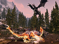
File:SR-quest-A Blade in the Dark.jpg
I saw this one on our social media and thought it looked very cool. The colours are great, it really captures the resurrection of a dragon in a stunning way.
- Support: As nominator. —Legoless (talk) 09:38, 27 July 2020 (UTC)
- Support: Fantastic shot in every way, loving the angles and the progress through the dragon resurrection animation this was taken at, don't often get to see it since it happens so fast. The Rim of the Sky (talk) 22:48, 28 July 2020 (UTC)
- Support: Per above. -Damon talk ♥ edits 15:58, 10 August 2020 (UTC)
- Support: As per comments above. This shot is pure awesome. -- Wolfborn (Howl) 17:57, 10 August 2020 (UTC)
- Support: Surprised it wasn't already featured, this is a good shot.Zebendal (talk) 06:55, 23 August 2020 (UTC)
- Support: Really great shot of a stunning scene! Both dragons are framed well and Sahloknir is captured at just the right point in his resurrection. --Oriwa Talk 04:29, 20 October 2020 (UTC)
File:ON-quest-Cultural Conciliation 08.jpg
A great action shot showing off both the quest objective and the landscape of Western Skyrim. The framing and colouring on this image is excellent.
- Support: As nominator. —Legoless (talk) 09:18, 17 June 2020 (UTC)
- Support: An excellent composition! MolagBallet (talk) 15:49, 17 June 2020 (UTC)
- Support: Definitely a good image for such a simple scene. --AKB Talk Cont Mail 16:06, 23 July 2020 (UTC)
- Weak Oppose: Not a whole lot going on and not a fan of the various low-poly textures and containers (sack of grain etc.) in the foreground. Neat scene tho. The Rim of the Sky (talk) 22:48, 28 July 2020 (UTC)
- Oppose: It's an okay image, but I'm more or less on the same feeling as Rim of the Sky here. And it's kinda hard to tell clearly what exactly the guy in the scene is doing so it's not a very clear image to look at in that regard. -Damon talk ♥ edits 15:58, 10 August 2020 (UTC)
File:ON-quest-City Under Siege 02.jpg
- Support: as nominator: Pretty great shot, cinematic, and colors work well and the elements all over the place from the conflict. ye its good. Zebendal (talk) 20:41, 4 April 2020 (GMT)
- Neutral: This is a really hot image! I agree that it looks very cinematic, almost like a promotional shot. The reason I am Neutral on this though is that in the format the image is going to be viewed the most, a thumbnail on the main page, there's a little bit of a lack of clarity in what all the image is depicting. This is no fault to the image itself; it's simply due to the nature of the subject itself being this fiery, smoke filled scene. I certainly can't oppose the image for this reason alone, but I also haven't been able to move all the way to a support either. Forfeit (talk) 23:09, 27 April 2020 (GMT)
- Support: Fire is pretty, and gets my support. --AKB Talk Cont Mail 16:06, 23 July 2020 (UTC)
- Support: Great image, do wish we can sort out what's going on with the file name. The Rim of the Sky (talk) 22:48, 28 July 2020 (UTC)
- Support: Per above -Damon talk ♥ edits 15:58, 10 August 2020 (UTC)
- Support: Very nice caption. Tib (talk) 17:31, 25 September 2020 (UTC)
File:SR-npc-Ulfric Stormcloak 06.jpg
I can't say I'm much of a fan of the subject, but I've always been a fan of this image. I thought this was nominated before at some point, but it doesn't seem that way. Since I'm in town for a second, I'll throw this into the mix before I head out! The background is really pretty which helps to make it a good thumbnail. However, once you look at it at full size, the expression on Ulfric's face is what sells this for me. I think it captures the thoughts and feelings of the character at this moment in time perfectly. You can also see a little surprise in the background once you look at the full size image too.
- Support: As nominator. Forfeit (talk) 01:11, 1 April 2020 (GMT)
- Support: It nicely captures Ulfric's expression after he realizes how everything he did was futile in the grand scheme of things. I might even feel a bit of sympathy for him. --Ilaro (talk) 19:20, 1 April 2020 (GMT)
- Support: The expression works well and colour scheme is nice. I don't recall how long its been since we had a Skyrim FI.--Talyyn (talk) 04:02, 5 April 2020 (GMT)
- Neutral: Boring to me. Not bad enough to oppose, though. --AKB Talk Cont Mail 16:06, 23 July 2020 (UTC)
- Comment: He's just standing there, menacingly! The Rim of the Sky (talk) 22:48, 28 July 2020 (UTC)
- Support: Per above -Damon talk ♥ edits 15:58, 10 August 2020 (UTC)
- Support: Per above. Great background and Ulfric's expression definitely adds a lot to it. --Oriwa Talk 04:29, 20 October 2020 (UTC)
File:ON-quest-The Cursed Skull.jpg
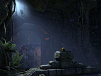
This is a beautiful shot. The golden skull is the focus here, contrasting against the gray stone and illuminated by the stunning ray of light filtering from the sky above. The image is high res; you can see all the details in the xanmeer's carvings. The flesh guardian in the background gives the viewer a sense of danger; the golden object on the pedestal is either being guarded by that thing, or the creature happens to be blocking the way of anyone who seeks the skull. Either way, the flesh colossus gives the viewer the sense that this place is dangerous, and whoever is going to retrieve that wonderfully illuminated artifact is going to have one heck of an adventure... which perfectly illustrates what Murkmire is about: a swashbuckling adventure!
Bottom line is, this image is beautiful and tells a story.
- Support: As nominator. --MolagBallet (talk) 19:08, 23 July 2020 (UTC)
- Support: Indiana Jones vibes. I like the beam of light. —Legoless (talk) 21:10, 23 July 2020 (UTC)
- Support: Simple, yet able to really show off the ambiance. = Thuraya Salaris (talk) 22:37, 28 July 2020 (UTC)
- Support: Really good timing and lighting, also like how out of context it looks like the colossus guardian just opened the door to find you with the skull. The Rim of the Sky (talk) 22:48, 28 July 2020 (UTC)
- Support: The eeriness really captures just how dark the Murkmire questline as a whole gets. Also gotta agree about the Raiders thing. Schiffy(Talk) 23:28, 28 July 2020 (UTC)
- Support: Very atmospheric.--Talyyn (talk) 01:36, 29 July 2020 (UTC)
File:ON-creature-Sand Serpent.jpg
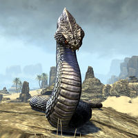
A really excellent shot of this enemy. Hard to capture ESO enemies at this level of detail.
- Support: As nominator. —Legoless (talk) 18:45, 10 July 2020 (UTC)
- Support: The subject is nicely centered, the colors contrast in a way that makes the subject easy to see and the whole composition pleasing to look at, and the level of detail is top-notch. My only criticism would be that the subject doesn't take up more space, but 1) the contrast and how centered the subject is makes up for that, and 2) It's a snake, it's not like some Chungus Bristleback where you can get the entire creature to take up most of the screen. -MolagBallet (talk) 22:53, 20 July 2020 (UTC)
- Support: Looks fantastic. Amazing lighting. --AKB Talk Cont Mail 16:06, 23 July 2020 (UTC)
- Support: Unfortunately a lot of the ON images I've seen don't even come close to this quality. This is very well done given the difficulties the online restrictions provide when attempting to capture an image. - Thuraya Salaris (talk) 22:37, 28 July 2020 (UTC)
- Support: Great background and pose on the snake. Not a fan of using base game eso images in 2020 due to asset re-use and outdated textures but this one is alright. The Rim of the Sky (talk) 22:48, 28 July 2020 (UTC)
| Prev: Archive 8 | Up: Featured Images/Past Nominations | Next: None |
