Oblivion Mod:ObEdit/Interface Development
This is both a description and a development discussion of the user interface of ObEdit, an alternate editor for Oblivion. The ultimate goal is to create a much improved interface over the Construction Set to make modding easier and faster.
Overall Application[edit]
This section discusses the general overall interface of the application.
| Item | Discussion |
|---|---|
| Multiple windows used per plugin |
This is generally a good thing since it prevents everything from being crammed into a single window. On the other hand, however, too many windows make the interface very busy, especially if multiple plugins are loaded. ObEdit will have the record list as the main window for a plugin. When this window is closed, the plugin and any other windows associated with it are closed. Other windows for the plugin can be opened and closed as needed. Possible windows per plugin might include:
Possible application windows might include:
|
| Only one plugin can be edited at a time in the CS (confirm?) | ObEdit will use a standard MDI (Multiple Document Interface) design to easily allow multiple plugins at once. To avoid running out of memory the Oblivion.esm master file will only be loaded once per session. There still may be memory issues if several large plugins or other master files are loaded at once. |
| Modal and Non-Modal Windows |
ObEdit will try to use non-modal windows as much as possible but there are several cases where modal windows are needed. Simple windows, like prompts or simple record selection, will be modal as it simplifies the program design and using a non-modal window in such cases doesn't provide a any benefit. Larger and more complex windows should be non-modal if possible. For programming purposes a window may be initially modal for simplicity and testing and then be later made non-modal as development time permits. |
Record Tree[edit]
This section discusses the record tree control as seen on the left side of the main record list.
| Item | Discussion |
|---|---|
| Benefits | This is one of the more important improvements over the Morrowind CS which used a tab dialog and MwEdit which used a simple list rather than a tree. This concept will be kept but improved upon as needed. |
| Customization | The main benefit to using a record tree as it allows records to be broken up into numerous categories making it much easier to find a specific record. The tree categories in the CS seems to be hardcoded but ObEdit will allow the tree to be customized by the user. This extends the usefulness of the tree concept and allows the user to become more efficient by defining categories according to what they are modding and how. |
| Included Records | The tree in the CS does not include all record types and a good amount of records can only be edited from various menus. ObEdit will add all records types to the tree and remove all menus. This makes the program much simpler as there are very few special cases to consider as all records are handled by the same tree and list controls. It also makes for a much more consistent interface as all records are viewed and edited in exactly the same manner (no more hunting menus for a particular record type).
Putting all records in the tree, however, does eliminate the possibility of viewing two records types at the same time. For instance, in the CS you could be editing dialogs (in their own window) while still viewing records in the main list. In ObEdit you would have to switch between the two types. Putting all records in the tree, however, has far more benefits than disadvantages and any potential issues can be better solved by other design patterns (such as bookmarks or multiple views). |
| Record Count | A minor improvement is to include the count of all record contained in each category. |
Record List[edit]
This section discusses the record list control as seen in the main window.
| Item | Discussion |
|---|---|
| Benefits | The record list is pretty standard and is a good way of showing an array of records. Any changes to this will be relatively minor. |
| Sorting | One main advantage of using a list to display records is that it allows the user to easily sort the list by any column. Unfortunately, the CS does not properly sort some columns for some reason. All columns in the record list in ObEdit will be properly sortable. The default sort will also be chosen to be the most useful, such as sorting first by all active records and then by editorid. |
| Long Lists | The general problem with UI lists is that the longer they are, the less useful they become. If you have several thousand records in a single list it becomes more and more difficult to find a particular record in that list. This issue will actually be solved by adding more categories to the record tree in addition to allowing custom categories. This will allow the user to narrow down larger lists to a degree that they are more manageable in size. |
| Displayed Columns | ObEdit will display many more columns for each record type than are displayed in the CS. It will attempt to display all record information that can be easily displayed in a list (some data is too large or cannot fit nicely within a list view). This will allow the user to easily view and sort any record properties. It will, however, make some record lists extremely wide. Lists will default to displaying the more important information on the left side where it is visible by default. List customization may also be supported to allow users to define which columns are displayed in which order. |
| Saving State | The record list in ObEdit will save the state of the record list (sort order, column order, and column widths) as much as possible. This means that when switching between record types the same list will appear exactly the same as the last time you viewed it. For example, if you made the editorid column wider and sorted by weight in the armor list it would have the same state whenever you changed back to it. |
| Color Coding | MwEdit used simple color coding in the record list to help identify special records. Green was an active record and red was a deleted record. Similar optional color coding will be used in ObEdit. |
| Viewing Active Records | Much of the time when modding you will be editing active records in the current plugin. The user interface should be able to make it easier and faster to do so. Part of this will be color coding active records. Another part will be allowing a sort so that active records appear at the top of the list (this can also be the default sort). This can either be by formid (the largest formids should always be in the active mod) or in a similar fashion to MwEdit by displaying the active status in a separate column (ObEdit will use the Flags column). |
Biped Parts[edit]
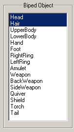
The CS includes a list of biped parts on armor and clothing dialogs. This is a good interface but it takes up a lot of room on the dialog for the small amount of time it will actually be used.
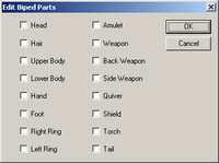
This was the first version of the biped parts dialog using checkboxes. It is a modal dialog which makes allows it to be reused where ever needed and does not clutter the record dialog interface.
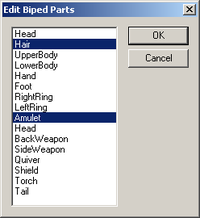
This is another version of the modal biped parts dialog using a list control identical to that found in the CS. The list is slightly better than using multiple checkboxes and it will be familiar to users of the CS.
This is the actual biped parts control as found on the armor and clothing dialog. The current values are shown as a list of strings and the modal parts dialog can be displayed by clicking on the button on the right.


