General:The Dragon's Eyrie/Shadowkey
Shadowkey I"In the fantasy empire of Tamriel, Shadowmage Skelos Undriel is on the run and hotly pursued by agents of Battlemage Jagar Tharn. Driven from the heart of the empire, Undriel flees to the Western Reach to find refuge -- and instead finds himself in the middle of The War of the Bend'r-mahk, a fierce conflict between the regions of High Rock, Hammerfell, and Skyrim. Undriel hides himself in the chaos enveloping the region of Dragonstar, where he hatches a desperate plan: collect the Shadowkeys -- magical objects strewn about the area -- and gather enough strength to overcome Tharn's agents, then face the terrifying shadow power of the Umbra' Keth.
Your village has safely remained just out of reach of The War of the Bend'r-mahk, but now danger strikes from another direction. You must save your village from marauders who are but pawns in the struggle to capture Shadowmage Skelos Undriel, who himself is but one more piece in a darker and more sinister game. You'll journey through rugged terrain, despoiled temples, bandit lairs, and murderous caverns. You'll fight many foes in your search for the power of the Shadowkeys and the Star Teeth, and your journey will lead you to the ultimate test, deep in the Crypt of the Heart."
Shadowkey was the third in the Elder Scrolls Travels series that I was comissioned for. This time the game was designed specifically for the N-Gage, the mobile gaming system from Nokia. Being a new system, it involved more work than normal, as , in addition to creating the art, the device itself had to be "learned", it's capabilities worked out and a style created that would make the most of the new unit.
I was responsible for the bulk of the creature and character design work, the cover , 1st person weapons/spells and some of the level creation. The level creation involved using a propriety editor and creating and texturing the levels. I was also responsible for supplying some of the advertising/manual artwork, some of which is seen here.
Creature Creation[edit]
The previous Travels games were phone based, but the N-gage is a far more sophisticated beast and this allowed us to use "real" 3D and so allow a look much closer look to the main Elder Scrolls titles such as Daggerfall and Morrowind. As such, the title required a full set of creatures and characters with which to interact, all contained in a large and diverse world for the player to explore. This game was also be in first person, as all previous Elder Scrolls titles had been.
Although not as powerful as a full PC, the N-gage it did allow for a game closer to the Arena or Daggerfall experience. As such I initially tailored the artwork to "feel" more like those older games, as time went on, I gradually brought in design elements from Morrowind.
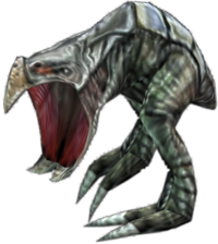
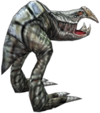
Here are some images showing the limited amount polygons used to create this creature, and an example of the creature textured as used in the game. Although limited in size, they worked fairly well due to the physically small N-gage screen.
 This image is lost to time.
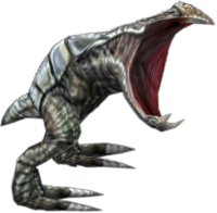
For the manual/advertising artwork, a higher polygon version was created along with larger textures, including additional bump maps. I'm always a concerned about giving out artwork that the general public might assume it is gaming art. I've bought too many games in my youth only too discover that the artwork I saw in the advertising was not necessarily that used in the game.
Wormmouth[edit]
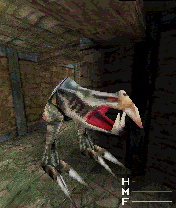
On most projects I usually have a favourite creature, and Shadowkey was not to be an exception. In this case it's the "wormmouth", as I called it. It started as a test, to see what could be accomplished with a small (64x64) texture and limited polygons. The test came out better than we had expected, especially when viewed on the N-gage's screen, and so we ended up keeping him. I'm always a fan of walking mouths!
Spider[edit]
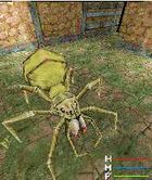
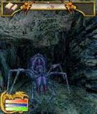
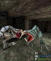
The giant spider is a traditional fantasy creature, and in Shadowkey we had four types, with one of them being a oversized queen. Below I've included an early shot from the game to compare with the higher resolution marketing versions.
Look closely at the spider and you'll see that it's lacking two of its legs. With only 6 months to complete all the work, and a limited polygon budget, I chose to build and animate only 6 legs. It still looks like a spider and walks like one, so I think we got away with it.
The "wormmouth" and spider were the first creatures created for the game, and with marketing wanting something to use rather quickly I used the game models as a base for these you see here. The schedule was fairly tight, about 6 month for art creation and within that time frame marketing artwork had to be produced, including the cover.
Character Artwork[edit]
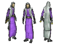
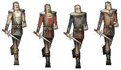
Seen here is an example of the character work involved in the game. Due to lack of memory we reused models wherever we could, relying on texture swapping to give the appearance of more model variety. Each character had around 200 polygons and used a 64x64 texture.
Considering that most of my recent modeling used 512x512 textures, this was certainly a challenge. I found myself using old "pixel" style artwork in many textures, particularly on character faces where one pixel could make a big difference.
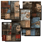
There was some discrepancy in texture placement between MAX and the final exported characters, and for a while many of them had a seam running down the middle of their faces. Some compensating of the original texturing was required to achieve satisfactory results. To the left are some examples of the textures used in the game. These are the actual size of those used in the game.
And here are samples of a single model with multiple textures.
The Cover[edit]
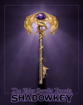
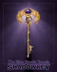
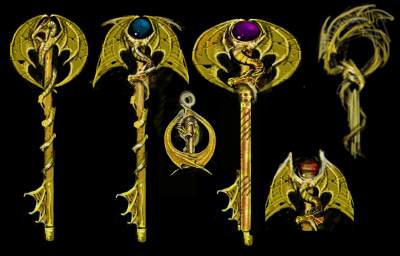
Below is an early sketch for the Shadowkey cover. As with Battlespire, I was pegged to design the cover for the game. After a few false starts it was decided that a simple and eye catching cover would work better. Taking the title literally, (the "shadowkeys" in the game use the same design) I created these sketches .
Once the design was approved I set about creating the image. I created various maps and these were laid down on a 3D "flat" . This allowed me to adjust lighting, coloring and other effects easily and quickly. The final image is a very large render.
the original concept/
Screen Shots[edit]
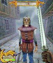
To the right is an early screen from the game. At this point the "draw distance" was greater. I was responsible for this level, which was a city scape and I tried to give it a medieval feel which I felt would be possible within the limits of the engine. The upper stories are mostly fake in this level. There's no way to physically get up there.
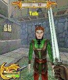
When texturing the models I used a quarter of the texture solely for the face. Most attention is drawn to the character's face and I think it was worth sacrificing the body textures for this.
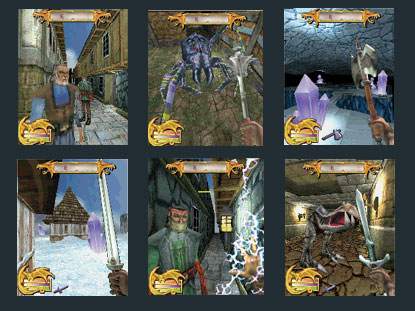
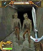
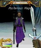
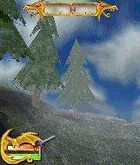
Here are a few more screen grabs from the N-gage. The characters and interface I designed and John Pearson (another Bethesda alum) designed the environments seen in these shots. Some way into the engine development it was decided to introduce "fogging". That is, instead of the world simply "popping" into existence it "faded" in from a solid color, giving the impression of a heavy fog.
Unfortunately, although this gave a lovely finished feel it also killed the lighting that many of the levels had. So torch light would be muddied, and glowing crystals glowed no more. More importantly for many, it slowed down the game.
Over all the game received a luke warm reception in many quarters. This certainly wasn't because lack of hard work, as everyone involved in Shadowkey's production worked extremely hard, with many lost weekends, late nights and spousal arguments! :o) Perhaps the game was too ambitious to try on a first outing on a new system. The artwork I felt in many respects achieved good results considering the limitation. Characters of 150-250 polygons with 64x64 textures worked well on the small screen. Slowdown was a problem and therefore animations appeared jerky but having reviewed them again recently in MAX I'm fairly happy with many of them.
Again, here is another early screen shot, again with the longer draw distance. Something to notice is the evolving co pass bar at the top of the screen. In the image to the right you can see an early version.
Textures[edit]
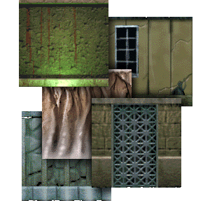
Here are some samples of the textures I created for the game. I work on a few of the levels, based on plans of Greg Gordon. He would supply on overhead map sketch, and from his detailed description we would create the level. I enjoy level creation but do not get much chance to work on any these days. I was lucky enough to have a few different locations, including a city scape, ice caves and volcanic pits. John Perason, another bethesda alum, was responsible for the bulk of the level creation.
Sample gameplay from the official trailer. Sorry it's so grainy, but it does show how well the game could run. I imagined this would be how Daggerfall might have looked had it been a completely 3D gam This image is lost to time.
